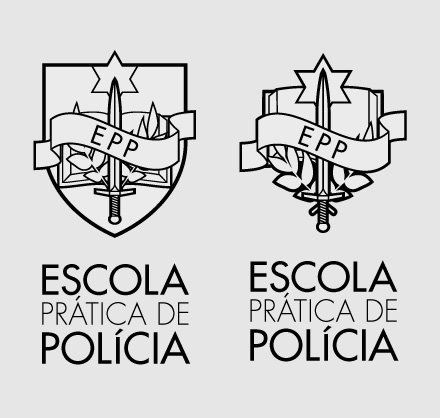
Escola Prática de Polícia
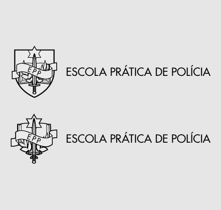
Logo designed for the Police Training School in Portugal.
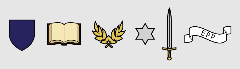
This involved some research work. I was looking into illustrating the school values. Ended up with the following elements and their respective meaning:
- Shield – defense weapon;
- Book – culture;
- Laurel twigs – intellectual merit;
- Star – police;
- Sword – power of knowledge;
- Ribbon – name of the institution.
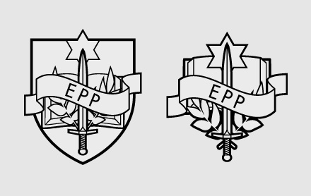
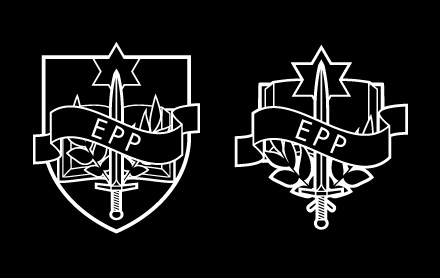
I prepared two different versions – with and without the shield. Did several colour and symbol/typography arrangement tests too.