My logo
Here’s how I got to design my own logo. I’ve tried several ideas, which allowed me to narrow it down to three different versions:
- The first one is a “T” and an “S” together, where the middle of the “S” overlaps the “T” – I found it a bit too bulky;
- The second version is again the two letters but with a much simpler shape – it looked like a deformed clip;
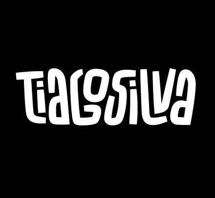
- Finally, I decided to make an illustration with my name on it, resembling my drawing style.
The third option was the winner. I appreciate simplicity, so I ended up going with the letter “T” only. And because I like regular shapes, I added a blue square.


