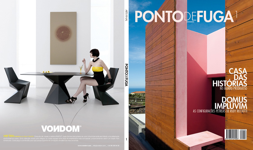
Ponto de Fuga
Little editorial design project for an architecture magazine called Ponto de Fuga. It consists of a cover, summary page and two articles.
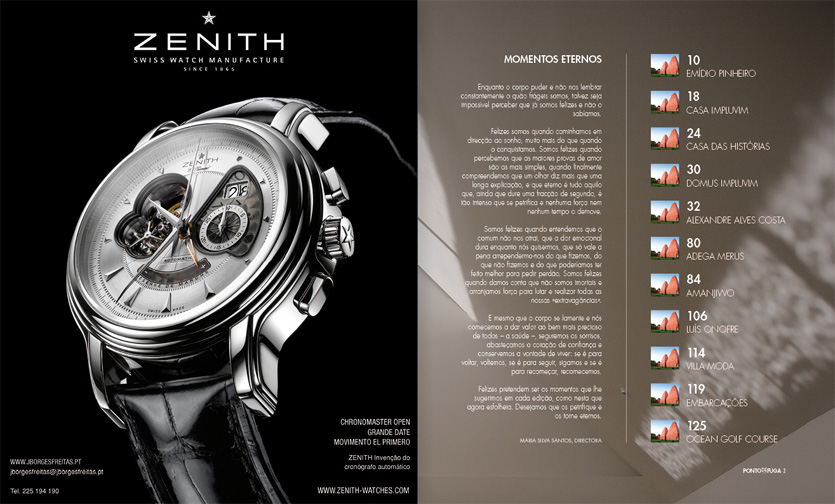
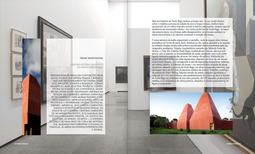
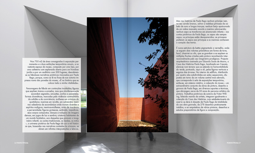
I’ve used a single sans-serif typeface with three variations. Text boxes were carefully aligned with images, clearly showing a well balanced structure – just like in architecture. The text is right aligned on even pages and left aligned on odd ones.